


Le Vieux Pin – The South of France in the west of Canada
An oldie but a goodie, Darren created this brand in 2006.
The winery building in Oliver, BC is an homage to a turn-of-the-century train station in the south of France.
After initially losing the pitch for the work, Darren was asked to provide a second opinion on the work done by the winning agency. The client felt that what they received was an identity and a label, but not a brand.
The winery’s plan was to be available only through top table restaurants in Vancouver, eschewing retail sales other than through select private wine stores and the winery.
Sadly, while the label and identity they had commissioned was pleasant and innocuous enough for the shelf, it had zero table presence. The bottle absolutely needed to be part of the conversation at the table. Such a captive audience needed to be exploited. The bottle needed to be picked up, talked about, remembered.
Also concerning was the timeline. The client was now behind by several months and would be bottling their first vintages in a matter of weeks and they had nothing other than a beautiful building and blank bottles.
Darren went to the Okanagan, post-haste, and took up temporary residence on the winery property. In the space of five days, he had facilitated the brand-visioning session, created the brand outline, colour palate, type treatments and initial label comps. He spent hours and hours with staff – the general manager/visionary, the wine maker, the vineyard manager and others – drilling down to discover the insights that would lead to a conversation-starting brand. When he needed a break, plucking leaves was a welcome respite.
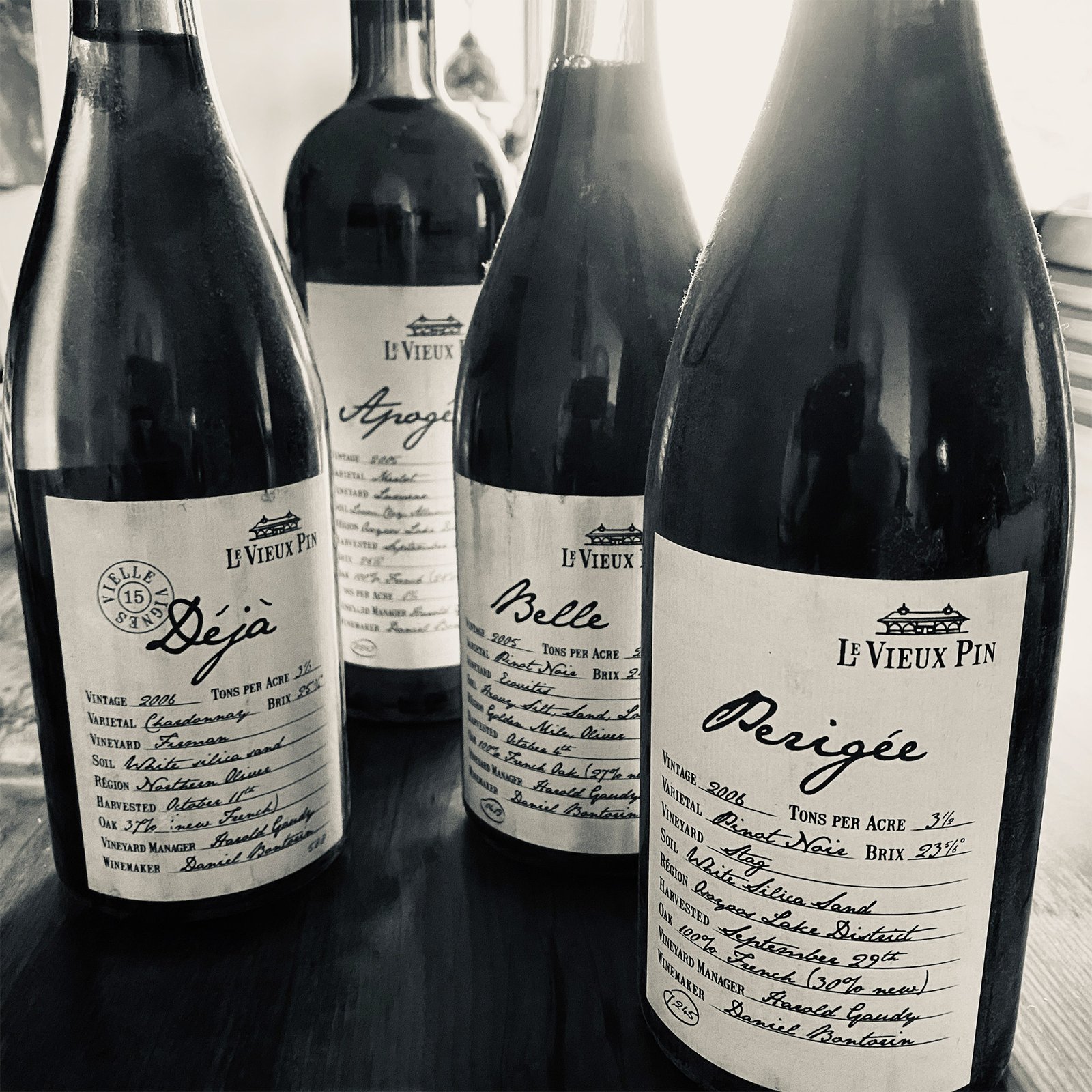
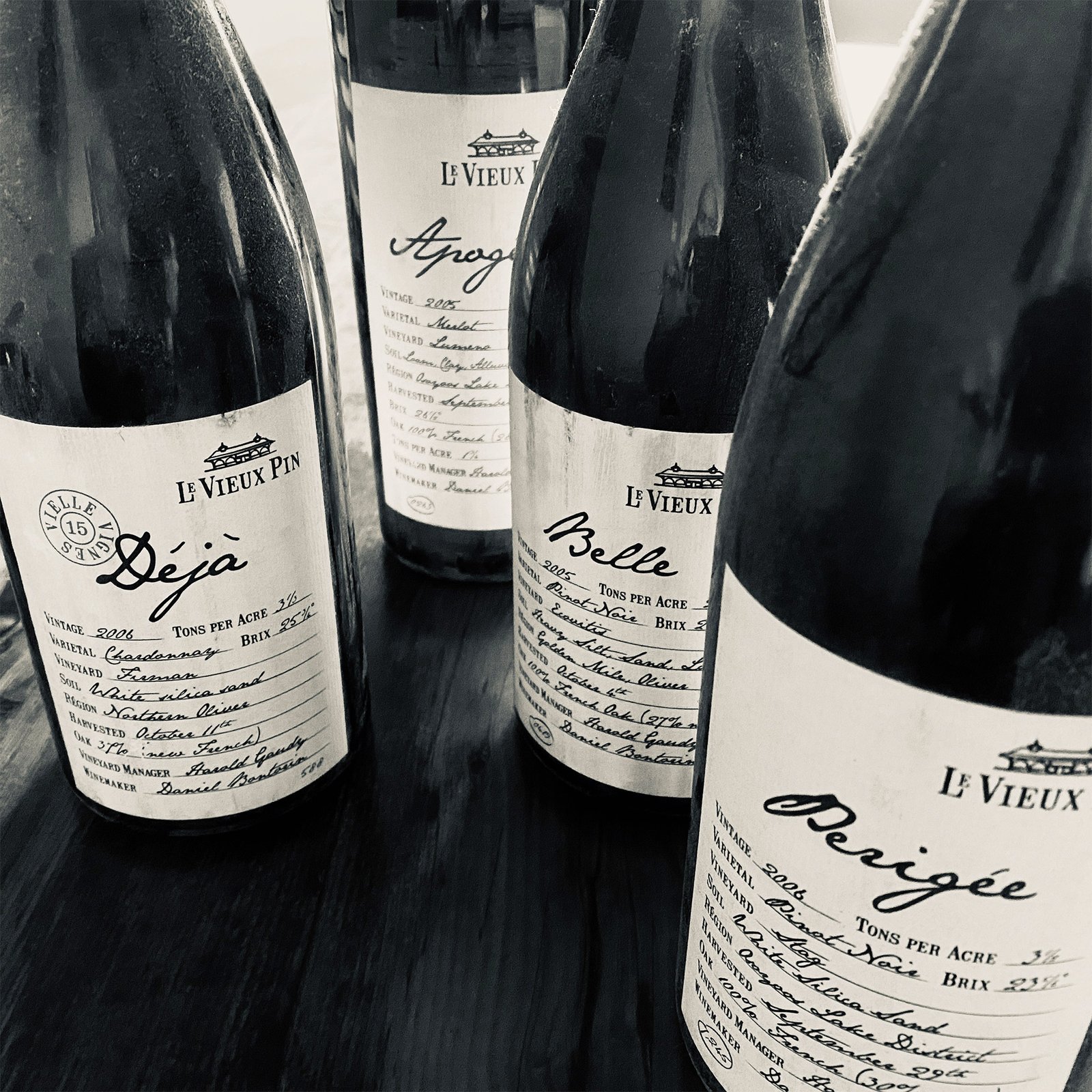
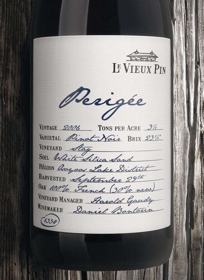
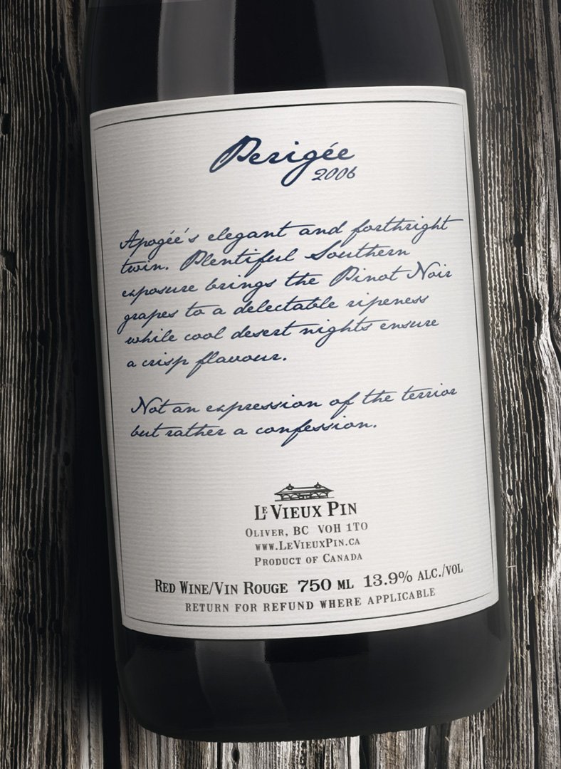
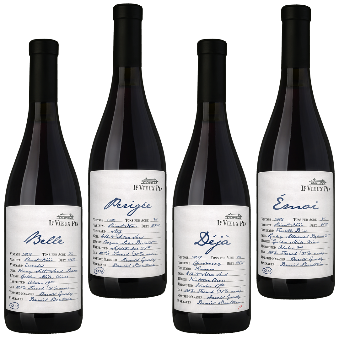
Thankfully, the client already had a name and had an architectural drawing that would spawn the brush-stroke icon. Using inspiration of place and period as well as the namesake on the winery (an old pine tree on a forgotten corner of the property) and a new set of brand pillars, the mood was a fairly obvious choice. Simple, humble, ancestral Provencal charm. Lavender lemonade to greet winery visitors. “Hand-written” labels with dates, harvest, brix and other notations. Sequentially-numbered bottles. Simple retail boxing using rubber stamps. Vintage Michelin inspired road signage. Random, low-production value imagery from around the property, treated to appear as archival images from generations past.
The labels were designed and quoted in a week. The content took another week to generate as the winery kept track of things like rainfall, hours of sunshine, etc. Then came sales materials, website, barrel tags, signage etc. Overall, it took about eight weeks to wrangle it all together.
The client has since shifted some of the label elements around. Shown here are the first vintages of the wines Darren worked on, showing collector wear. We’re not necessarily fans of these changes but are gratified to see that the road signs, erected in 2006, are still going strong. While Darren can’t claim huge originality on the label mechanics, little did he know, in 2006, that the detail style of label would be used in so many other wines in the years to follow. He also laments how popular this hand-written typeface has become.
